Thursday, August 25, 2011

Change of Focus


BEFORE: This little house with not-so-interesting architecture needed an update.  
 To focus on the garden, we needed to make the building blend into the landscape.
 In addition, the unattractively proportioned windows needed to be minimized.
AFTER: With new colors that harmonize with the landscape, the house now provides a wonderful backdrop for the garden.
 The window mullions were painted a darker color which makes them disappear!
 And, the apple green door provides a cheery entrance to a gardener's home.

Friday, February 4, 2011

Tie it together


To define the dining area in this open plan, a contrast wall in rich purple was painted to mirror a chair of the same color opposite in the living room.

Saturday, May 22, 2010

Green = Renewal & Harmony

Green signifies life, freshness, renewal and confers a sense of relaxation and comfort.  It's nature's perfect neutral - providing the background for all other colors.  This same natural versatility applies to the use of color in our homes and fits comfortably into any color scheme.  It is the easiest color for the eye to see.

Physiologically, green appears to restore mental equilibrium and a spiritual perspective to our lives.  Because of its calming effect, it is considered the great 'harmonizer'.

Choose greens for bedrooms or living rooms, or anywhere you'd like to be nourished and nurtured.

Saturday, April 17, 2010

Defining different areas with color

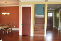
Choosing several colors of similar value and saturation defined separate areas in this open plan space. A welcoming green in the entrance hall opened into a warm golden living and kitchen area. The dining space was further defined with a warm rust as a contrast wall. You can catch a glimpse of the blue stairwell that will be a great backdrop for an art collection or family photo gallery.

Monday, March 8, 2010

Can't visualize?

For those who have a hard time visualizing a color combo for interior or exterior spaces, try the Color Viewer on the Benjamin Moore website. Using their photo examples, you can 'try out' different colors from their fan decks for free.

Or, for $10, you can download the Personal Color Viewer, enabling you to upload your own photos . A word of caution: this can be a bit clumsy when done with a mouse. Using a stylus and tablet makes it a bit easier to fill in color.

Remember, this can only give you a rough idea of color -- monitor color and print-outs will vary greatly from the 'real thing'. Color is site-specific.


Saturday, August 1, 2009

Color solution to architectural blandness

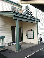
The homeowners specifically requested a dark gray to update a tired color scheme. They described the house as having two back sides with no real entry. With these things in mind, we chose a nice gray with cream trim to anchor the home to the landscape and mute the bland facade. To finish, we kicked up the yellow-green a notch to attract more attention to the recessed (and shaded) front door.
Here's what the house looked like before (left) ...and after (right).

Tuesday, May 12, 2009

In Progress


The exterior paint is nearly finished - still awaiting completion of the front entry.